10,000 search results
(0.027 seconds)
- Dog Butter Pro by No Bodoni,
$35.00 This is a curvaceous playful casual upright display script (the name inspired by Tibetan yak butter) and is unique due to the tall ascenders and cap heights combined with a small x-height and small cap height. Due to these variations I designed different heights of quote marks for visual consistency. There are five weights and multi Latin language support. This font is perfect for lingerie catalogs, gorgeous cookbooks, curvaceous branding and logo design, callipygian magazine heads, sumptuous restaurant and food designs, flamboyant word poetry and more.
 - Studded Leather Jackets by SynFonts,
$39.00 - Collins Butter Hollow by Omotu,
$18.00 Collins Butter is a display sans font. Comes with 2 fonts family, solid and hollow. Great for logotype, branding, packaging design, poster design, website / display, editorial, headline, and more. Whats Include? Uppercase and lowercase characters Supports international languages Opentype features: alternates and ligatures. Accessible in the Adobe Illustrator Glyphs panel, or under Stylistic Alternates in the Adobe Photoshop OpenType menu, Adobe InDesign, Corel Draw, even work on Microsoft Word
 - Hatter Display Pro by RodrigoTypo,
$35.00 This is the most complete and final version of Hatter, it contains more than 12 fonts, among them it contains Cyrillic, Swash, Alternatives, Dingbats, Ornaments, all to make an entertaining graphic.
 - Lecture Hall JNL by Jeff Levine,
$29.00 Lecture Hall JNL is a reworking of Dance Hall JNL. By removing the Art Deco flairs and realigning the horizontal strokes in order to create a more traditional design, the font now takes on the look of a classic headline face.
 - Marble Cutter JNL by Jeff Levine,
$29.00 A set of vintage dies for stamping text into marble headstones or other monuments manufactured by The Vermont Marble Company was the basis for Marble Cutter JNL. The Vermont Marble Company was in business from the 1880s until 1976, when the company was acquired by OMYA, Inc. The original company (also known as Vermarco) supplied marble for everything from the Jefferson Memorial to the United Nations building and dozens of other historic structures in-between.
 - Peanut Butter Man by PizzaDude.dk,
$20.00Forget everything about Times New Roman and all the other classic typefaces! Forget all that and take a bite of Peanut Butter Man! - A Day That Feels Better by Clevus,
$14.00 Proudly present A Day That Feels Better Typeface, created by ClevUs, A nostalgic serif & calligraphic italic that has own unique style & modern look. This typeface is perfect for an elegant & luxury logo, book or movie title design, fashion brand, magazine, clothes, lettering, quotes, and so much more. Font Features : Letters, numbers, symbols, and punctuation 101 alternates and ligatures No special software required they may be used even in Canva, any basic program /website apps that allows standard fonts That's it folks! Multilingual Support Language Support: Danish, English, Estonian, Filipino, Finnish, French, Friulian, Galician, German, Gusii, Indonesian, Irish, Italian, Luxembourgish, Norwegian Bokmål, Norwegian Nynorsk, Nyankole, Oromo, Portuguese, Romansh, Rombo, Spanish, Swedish, Swiss-German, Uzbek (Latin) Follow My Shop For Upcoming Updates Including Additional Glyphs And Language Support. And Please Message Me If You Want Your Language Included or If There Are Any Features or Glyph Requests, Feel Free to Send me A Message. Have a Good Day !
 - Dezter Black Metal Font by Tebaltipis Studio,
$35.00 Morse Font is a cool alternative for you to easily create a logo for your Underground band or whatever. Using alternate front and ending letters brings the font to life, It comes with a basic character set and a small group of symbols and signs often used in the extreme music sector.
 - LD Red Hatters Hand by Illustration Ink,
$3.00This whimsical font is thicker than normal and slightly toggled. It is playful and fun. - KG Two is Better Than One - Personal use only

- KG Two Is Better Than One by Kimberly Geswein,
$5.00 This font was created in honor of my husband for our 12th wedding anniversary. 14 years ago, I met this tall, skinny guy from Indiana in the lobby of a hotel in Hong Kong. We talked. The next day, we had lunch together. And that night we had dinner together. And the next day. And the next. We met just before my 19th birthday, and on my birthday he took me to the top of Victoria Peak, where we looked out over the city of Hong Kong- such a beautiful place to begin a lifetime of love! We spent 4 months together in Hong Kong, falling in love with each other and with the beautiful city we were privileged to call home for that short time. We married the next year. We've lived in Indiana, Texas, China, Kentucky, and Florida over those 12 years of marriage and have welcomed 2 daughters into our lives. I know beyond a shadow of a doubt that he completes my life in a way I didn't know was possible. And I know that I'm blessed beyond words to have a supportive, wonderful, encouraging husband who is also a loving, involved, caring dad to our daughters. This font is for you, Keith!
 - Snowshoe - Unknown license

- Locked Window - Unknown license

- Ass - Unknown license

- Divine - Unknown license

- Maye Calistial by Maulana Creative,
$13.00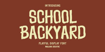 School Backyard playful display font. Regular stroke, fun character with a bit of ligatures and alternates. To give you an extra creative work. School Backyard font support multilingual more than 100+ language. This font is good for logo design, Social media, Movie Titles, Books Titles, a short text even a long text letter and good for your secondary text font with script or serif. Make a stunning work with School Backyard font. Cheers, Maulana Creative
 - Seasick by Ingrimayne Type,
$8.95Seasick and Seasick-Mirror features wobbly, wavy, distorted letters. They were derived from the almost monoline font Kwersity. The letters of Seasick have a slight backward slant and the letters of SeasickMirror have a slight forward slant. Each of them comes in four weights: Light, Regular, Bold, and ExtraBold. - Janda Celebration Script - Personal use only

- ALS Fuchsia by Art. Lebedev Studio,
$63.00 Fuchsia is a soft, romantic, and slightly eclectic script. The characters feature wide proportions, high contrast, and backward bends at joints—all ensuring the typeface truly shine in large sizes. Complex capitals look very nice next to lowercase letters.
 - Supaduper PB by Pink Broccoli,
$16.00 Supaduper PB is a font inspired by some wonderfully funky hand-lettered greeting cards from the 1980's. The delightfully awkward and animated playfulness of this lettering style was maintained throughout the fleshing out from the original specimens - and I think you're going to have a lot of fun typing with this. Even if you haven't seen these old greeting cards, the lettering style has a familiar visual to it. Bring back a little nostalgia, add a little wonkiness, or just have fun typing with Supaduper PB today!
 - KG Be Still & Know - Personal use only

- Goondocks PB by Pink Broccoli,
$14.00 HEY YOU GUYS! Goondocks PB is a faithful recreation of the titling font from 1985 film, "The Goonies". This was a lot of fun to recreate and flesh out, and it has that purposefully awkward appeal that a lot of Pink Broccoli fonts are imbued with. With a pseudo unicase styling, wonky blockish style lettering, and that visceral tieback to the 80's, Goondocks brings back fond memories, perfect for those unorthodox creative designs.
 - Back And Forth by A New Machine,
$10.00 This all cap, bold, sans serif font features one face that slants backward ("Back") and one that slants forward ("Forth"). Use in combination to create headlines and designs that call for a sense of speed, motion and power. Uppercase and lowercase letters are the same.
 - 19th Century Retro by Matthias Luh,
$35.00 19th Century Retro is a re-design of an official German font style (called ‘Fraktur’) which was used in official documents in the 19th and early 20th century. There is an alternative small letter ‘s’ which you generate by typing the @ sign. This alternative letter was the original small letter s which was printed in the middle and at the beginning of a word originally (for example in the words ‘slightly’ and ‘best’). However, if the s was at the end, the normal small letter s was used (for example in the words ‘it's’ and ‘columns’). For readability reasons I decided to put the normal small letter s onto the s-key on your keyboard.
 - High German by Grummedia,
$20.00Based on examples of common medieval Gothic typefaces, High German has lots of character, giving an immediate impression of the densely packed pages of the 'traditional' backward looking printers of the day. - Fresh Squeezed by LetterBalm,
$19.99 A Splashy font inspired by all things liquid and wet, the goal was to create a fun and realistic representation of water in the form of a letter. Water parks, Juice bars, your backyard pool party or your box of fresh squeezed orange juice, any time you need a good splash.
 - Schoolmarm JNL by Jeff Levine,
$29.00A large assortment of stencil lettering guides made in the 1940's, 1950's and 1960's have been a treasure trove of wonderful "lost" stencil type designs. Schoolmarm JNL continues this series by font designer Jeff Levine. - Reross by Adobe,
$29.00Of all student work produced in Joost Schmidt?s Bauhaus classes, Reinhold Rossig?s (1903?1979) alphabet designs are perhaps closest to his master?s teachings: monolinear, geometric lettering, constructed on grids using compass and ruler. Drafts by Rossig, dated 1929, also demonstrate explorations of letterform width and x-height. Almost ninety years later, Elia Preuss carefully preserves Rossig?s letters and considerations in a proper typeface, by overcoming most of the optical mistakes captured in true geometric letterforms. To carry Rossig?s design further away from Schmidt?s influence, Preuss also lent more characteristic letters found on poster designs by fellow Bauhaus student Hermann Werner Kubsch. Reross is a true Bauhaus-influenced geometric sans, equipped with different historic influences and contemporary features. - Gaffer by Typadelic,
$9.95 Gaffer is a simple little font! The backward slant, large x-height and short ascenders/descenders give the font a casual handwritten look. I’ve included some extra ligatures (ffi, ffl, ff, ks, tt, tf, ft, st) which will substitute automatically when used with OpenType savvy applications. Use Gaffer for projects where you need a casual look: on the web, scrapbooking, greeting cards, emails or a letter to a friend. Where would *you* use Gaffer?
 - Southern Flight by Intellecta Design,
$9.00typeface based on old lettering by an 1930's advertise lettering in a Flight Magazine - Deutsche Poster Steinschrift by Intellecta Design,
$19.90inspired in plakat stijl, a german style of lettering used in 30's advertise lettering - Contouration by Intellecta Design,
$19.90inspired by and advertise lettering publishing from 1920's - Gv Time by Bejeletter,
$18.00 Inspired from 60's and 70's script lettering, bringing a smile and a dose of nostalgia to the daily lives. Where you get to relive the far out culture of the 60’s and 70’s! The era of groovy was all about music, festivals, where icons were created, epic stories were told, and culture was changed forever. The Gv. time came with opentype features such stylistic alternates and others, its help you to make great lettering, also support multilanguage.
 - Uncanny Cat PB by Pink Broccoli,
$16.00 Inspired by the 1977 anthology horror film called "Uncanny", Uncanny Cat PB captures all the awkward fun of the film's titling sequence. Feline revenge has never looked so good. This typeface was oodles of fun to flesh out, and is true to that purposefully awkward appeal that a lot of Pink Broccoli fonts are imbued with. Loaded with a collection of ligatures that combine and nest letters against each other, lending to the unique typesetting of this "uncanny" font.
 - 1634 René Descartes by GLC,
$38.00 This font was inspired by the well-known philosopher René Descartes' hand writing. In 1634, from Amsterdam, he wrote a famous letter to his friend Mersenne, a great scientist monk, in which he spoke about Gallileus works. The greatest part of our glyphs is based on this document. We have added some letters Descartes himself didn't use, like modern s and j (he used exclusively s long and i instead of j). A lot of ligatures and alternates are enriching the font, giving a better appearance of real handwriting.
 - Tape Back by Adam Ladd,
$5.00 The Tape Back family comes in three weights. Each are monoline in weight and have a modern yet slightly quirky appearance. It is informal but has some stability with its linear forms. The slant backwards makes it unique, and it displays well even for body text.
 - Diehl Deco - Unknown license

- Via Roma Display by Font&Co.,
$19.00 A font inspired by regime propaganda inscriptions found in Italian institutional and civic architecture of the 20’s and 30’s. Bold, severe lettering, suggestive of pre-war Italian Art Deco and American Depression Modern aesthetics.
 - Diehl Deco - Alts - Unknown license


